GM x Automotive UX
University of Michigan
Sierra EV:
Designing the
future of truck
Role
Researcher & Designer
Team
3 Members
Timeline
~4 Months

THE INDUSTRY REMOVED THE BUTTONS, WE FIGURED OUT WHERE THEY
SHOULD GO
As vehicles go software-defined, physical controls are disappearing into screens. For truck drivers working in gloves, on mob sites, while towing, that's not a preference issue, it's also a safety one.
THREE FEATURES, THREE SCENARIOS USER FACES OFTEN
Eyes-free control while driving, aerial visibility at the worksite, spatial guidance for complex maneuvers — each feature targeting a gap that current truck interfaces don't address.
FROM A COURSE BRIEF TO A GM STAKEHOLDER ROOM
A near-future concept for the Sierra EV, presented to GM designers in April 2026 and received as a credible direction for 2030+.
01
The industry is moving toward SDVs. Makes sense for the business but not always for the users.
Less hardware, lower production costs, more flexibility through over-the-air updates. It makes business sense. But there's a cost. Physical controls are disappearing into touchscreens. Drivers who spent years building muscle memory are now relearning how to operate their vehicles. The cognitive load has increased enough that EU regulators are actively pushing back, mandating the return of physical controls for critical functions.
Truck drivers feel this more than most. Worksites, towing, off-road terrain — these are contexts where looking away from the road to navigate a menu isn't just inconvenient, it's dangerous.

02
We went to Detroit before we designed anything.
Before settling on a vehicle or direction, the team attended the Detroit Auto Show to benchmark firsthand, sitting in and interacting with vehicles across the competitive set. We focused on three: the Sierra EV as our subject, the Toyota Tundra as a legacy competitor, and the BYD Yangwang U8 as the tech-forward extreme.
The Sierra EV sat between them, capable hardware, modern software, real interaction friction. We chose it because it hadn't fully committed to either side. That made it the right canvas.
Legacy Competitor
TOYOTA TUNDRA
Tactile and reliable. Physical controls everywhere. But limited capability and no real software ambition.
Tech Forward
BYD YANGWANG U8
Impressive features. But buried in non-obvious menus, capability that most users never find.
Our Choice
SIERRA EV ELEVATION
Capable hardware. Modern software layer. Real interaction friction. The right canvas, not fully committed to either side.


03
Research came from Reddit forums, YouTube reviews, and auto community discussions
The finding wasn't "users prefer physical buttons." It was more specific. Headlights are no longer physical. The garage control is three menus deep. Tactile feedback is inconsistent. And the question that kept coming up: what happens if the screen stops working?
My gloves don't work with screens
I expected all trims to include a hUD
Dashboard / IA / layout
Physical controls / tactility
Subscription / connectivity
Navigation / system consistency
Garage / accessibility
User / persona signals
04
The first layout was trying to do too much.
Everything was accessible. Nothing was clear.
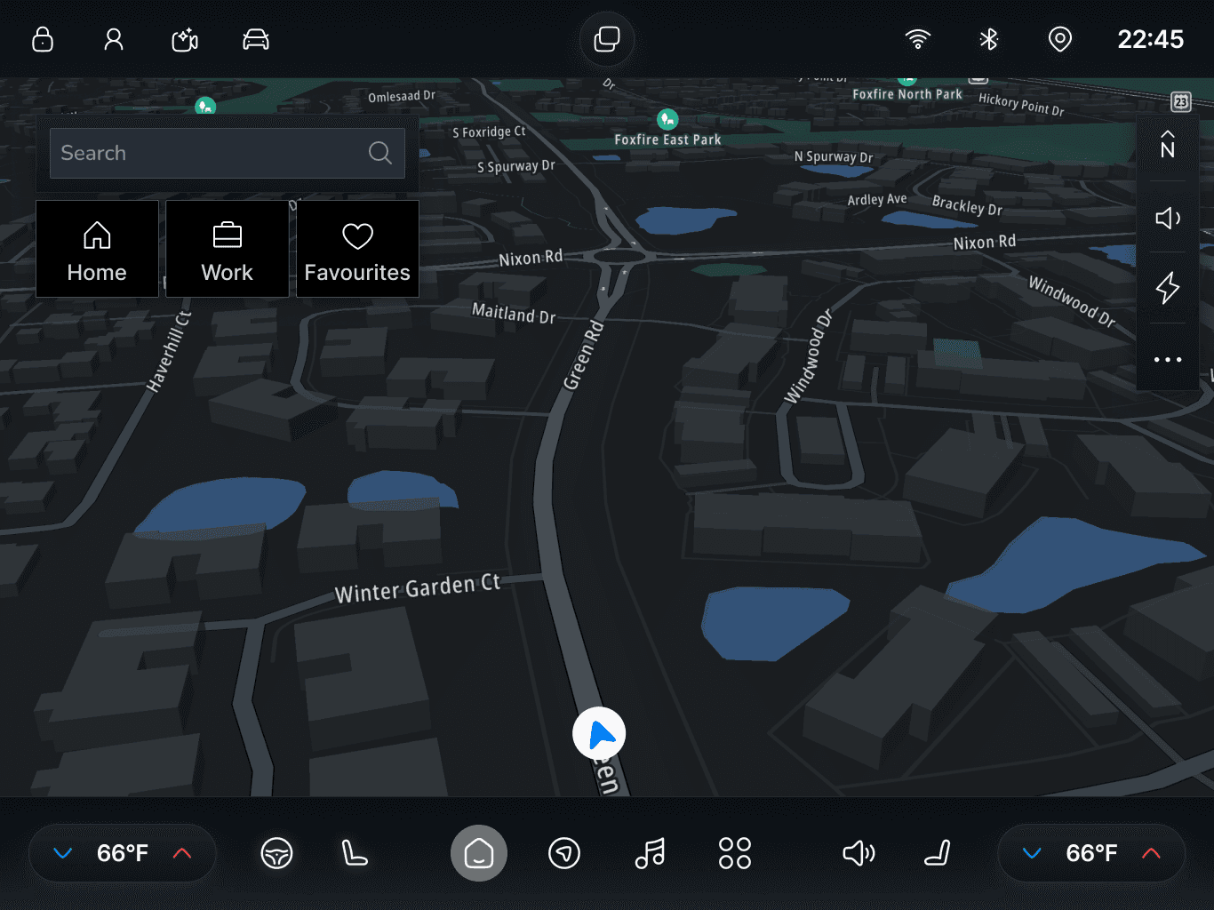
Before
Nav at the bottom, alongside climate controls. Quick actions across both sides of the top bar. Split-screen button in the middle.
The bottom bar was doing three jobs at once. Every glance required identifying what type of control it was before using it, the wrong mental work while driving.
After
Nav moved to the top: home, apps, two to three pinned actions. Nothing else persistent. Menus became contextual — surfacing only when relevant.
Bottom bar freed entirely. That one decision made the hard controls feature possible — the physical keys below the console finally had a clear, dedicated counterpart on screen.
Before

After
05
Three Features. One Through-Line.
Each feature addresses the same core tension from a different layer. Truck drivers in demanding contexts need to act quickly, accurately, without pulling attention from the road.
Customizable Hard Controls
Physical reliability at the point of interaction. Muscle memory, not menu navigation.
Sierra Vision Drone
Spatial awareness beyond what the vehicle can see. Worksites, off-road, towing.
RoadView Assist
Real-time spatial guidance for complex maneuvers — built for a vehicle that doesn't ship with a HUD.

1
Customizable Hard Controls
THE IDEA
Three keys are fixed — volume, driver temperature, passenger temperature. High-frequency, always available, no learning required. The rest are fully remappable to any app action or vehicle control.
WHY
Physical controls are buried to deep
EU regulators are now mandating hard controls
"My gloves don't work with screens"
Before Usability Testing
The first version had three separate entry points: open an app, perform an in-app action, or create a custom action. Too much disambiguation upfront. Users didn't understand what "Action Trigger" meant and "Custom Action" was turning to be complicated flow.

After Usability Testing
We simplified: select the app first, then choose to open it or trigger a specific action within it. Custom actions moved out of the mapping flow entirely. A contextual button in the top bar saves whatever screen state the user is currently in — one tap maps that exact state to a key.

2
The Truck As A Platform, Not Just A Vehicle.
THE IDEA
The drone is an opt-in accessory that extends what the Sierra EV can do, not a feature baked in for everyone. The goal was to move GMC beyond a vehicle into a broader lifestyle ecosystem. The drone is one piece of that.
WHY
Competitors like BYD have already integrated it
A construction site manager, off roading spotter, and more
Creating an ecosystem by pitching GMC as a lifestyle brand
1
Survey Site
Daniel manages a construction site. Instead of walking the entire site to check progress, he launches the drone from the truck and runs an automated aerial survey, capturing photos, annotating areas, tracking completion, while handling other tasks.

2

Off-Road Assist
Off-road driving usually means someone gets out to guide the vehicle through difficult terrain. The drone takes that role, scanning the path ahead, flagging hazards, overlaying a suggested route, and feeding real-time stability and traction data back to the display.
3
Tow Assist
The drone detects the trailer, reads its dimensions, and auto-fills type, weight class, ball size, and tongue length. Combined with the truck's self-driving capability, it then auto-aligns the hitch, removing the trial-and-error that makes solo trailer hookup genuinely painful.

4

Photography
A lighter-weight use case. Shot type, drone distance, angle, all controllable from the display.
3
RoadView Assist
THE IDEA
Drivers misjudge turning radius, trailer swing, lane change clearance. Standard maps give you data. The interpretation is still on you. RoadView Assist converts a geometry problem into a visual match task.
WHY
The Sierra EV Elevation doesn't ship with a HUD
Community research consistently surfaced towing anxiety
No competitor had addressed this problem for large trucks
Left Turn at Signal
Wide truck, narrow street, curb on one side and opposing lane pressure on the other. You can't intuit how much to swing out, whether the rear will clip the curb, or if you'll drift into the adjacent lane.
Lane Change
Changing lanes in traffic with vehicles in blind spots. Mirrors don't give full coverage at this size. Distance judgment is unreliable. You don't know how close is too close.
Lane Change with Trailer
Now you're managing two bodies with delayed movement between them. Most drivers cannot predict where the trailer tail will end up — which is where side swipes, oversteer corrections, and panic braking happen.
Highway Exit
One mile from your exit, driving fast, in the wrong lane. A large truck takes longer to reposition. Missing the exit is costly. The pressure to move quickly leads to unsafe merges.


06
We Built For Rugged, Not Minimal.
Ultra-minimalism is the dominant aesthetic in the EV space. We pushed back on it. GMC's identity is capability-forward, not tech-forward. A stripped-down interface would have felt borrowed.
The dark theme, visual weight, and structured iconography maintain continuity with the brand Sierra EV drivers already identify with. This also shaped the storytelling — each feature was framed around a specific moment in Daniel's day, not a product capability list.
07
What I'd Redo.
Go deeper on one feature instead of wider across three.
Three features spread the work thin. One feature, fully researched, rigorously tested, and built out in complete interaction flows, would have been more convincing to GM than three features treated at surface level.
Primary research would have sharpened everything.
Secondary research gave us direction, but interviews with actual Sierra EV owners, especially work-use drivers, would have tightened the problem framing and given every feature decision a more grounded foundation.